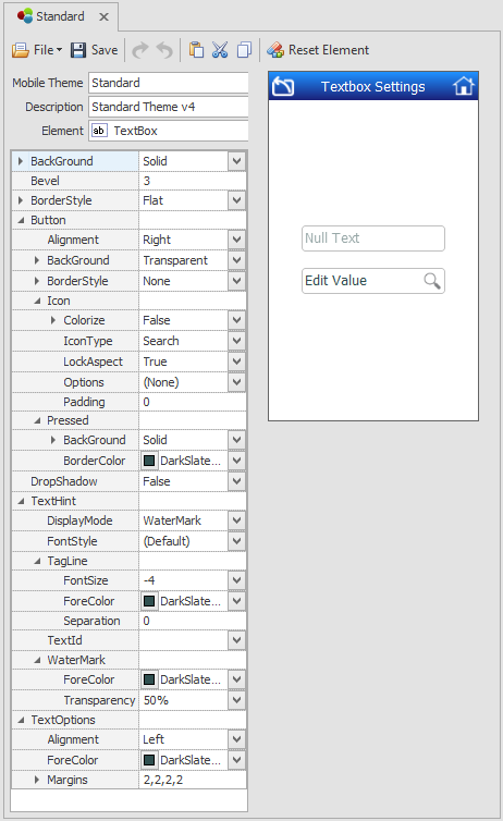
Themes: TextBoxes

This sets the theme for the TextBox control.
In addition to setting TextBox styles, you can also customize and set an icon (Icon > IconType) inside a TextBox and set its stretches or not allow it to stretch via th (LockAspect property and how its positions via the Options property. The default is the Search icon (and search event is also a built-in event), but other actions are available. If you also set how it when the icon looks when it pressed using the Pressed properties.
If you are planning to add TextHints to your control, you can stylize how it appears here. TextHints are the words or hints that appear above/below/besides a TextBox or inside a TextBox to help the end user know what to enter into the prompt/TextBox. TextHint >Display Modes are: Both - will display a TagLine and WaterMark; Tagline allows only the Tagline (TextHint Text) to appear outside the textbox; WaterMark only allows the texthint to appear inside the TextBox; and Toggle will go back and forth between an external and internal of text.
If you decide to use the WaterMark/NullText feature, note that the WaterMark styles is affected by the BackColor, BackStyle and ForeColors listed below. Depending on the value selected for the WaterMark, the TextBox theme can be setup to appear as if it has a Label on top of the prompt or a watermark inside the prompt.
BackColor – the primary background color in the Textbox.
BackColorAlt – the secondary background color in the Textbox.
BackStyle – sets background colors as blended/solid if BackColor and BackColorAlt are used in the textbox.
Bevel – sets roundness of the corners of a square or rectangular-shaped object such as a button, panel, tab control, or textbox. “0” will no bevel edges; “2” is the average setting for a rounded corner; “4” is typically used on objects in Android.
BorderColor – sets the color of a control’s border.
BorderStyle – sets the style as None, Flat, Sunken, or Raised.
ForeColor – sets the font coloring in the textbox. Note that if the WaterMark property is used, the ForeColor here will control the color of the WaterMark, but the WaterMark Transparency value will also control the appearance of the text in the TextBox.
BackColor, BackColorAlt, BackStyle, BorderColor, and BorderStyle, and ForeColor are applied the same as in other examples.
Pressed – sets the theme for the Search button (or the IconType) when its tapped/pressed by the end user.
BackColor, BackColorAlt, BackStyle, BorderColor, BorderStyle, and ForeColor are applied the same as in other examples.
Watermarks – sets the theme for the label (i.e. the yellow label which appears outside the textbox) when the Watermark is used. The WaterMark if set to external will make the Caption appear as a "label" above the prompt. If set to Internal, the Caption will appear as text inside the prompt. Note that the Caption property is in the Designer view of the TextBox in Applications.

ForeColor – sets the color of the label for the Watermark when ShowLabel is enabled and the Watermark is enabled.
FontSize – sets the color of the label for the Watermark when ShowLabel is enabled and the Watermark is enabled.
Font Style - sets the style of the label for the Watermark when ShowLabel is enabled and the Watermark is enabled.
Transparency - sets the degree of transparency for the Watermark when the Watermark is enabled. 0 is not transparent, 100 will make the Watermark invisible.
Note: There are no VBA extensions for the WaterMark – all text must be entered in the WaterMark’s Text property.